Lonely Planet
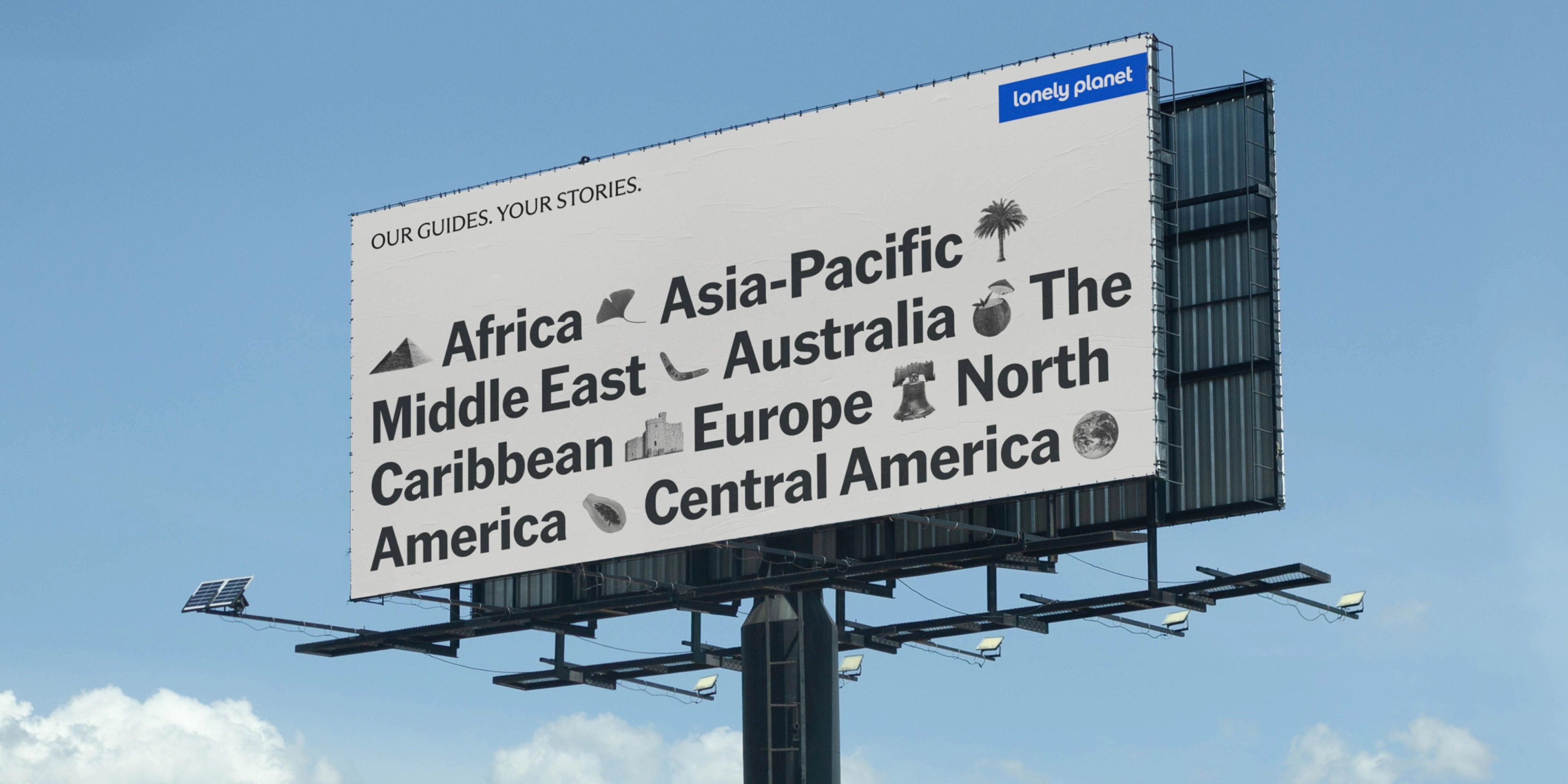
Our Guides. Your Stories.
GrandArmy partnered with Lonely Planet to bring together their rich history in print with the modern, digital age to bring the fun and beauty of publishing to new audiences.
In recent years, the world of publishing and the travel industry alike have transformed, and in turn the ways people access information is expanding. GrandArmy worked to embrace Lonely Planet's legacy while folding it into something more expansive than ever before.
In 1972, Lonely Planet founders Tony & Maureen Wheeler published their first guidebook: Across Asia on the Cheap. Since then, Lonely Planet has provided travel expertise to
a passionate fanbase.
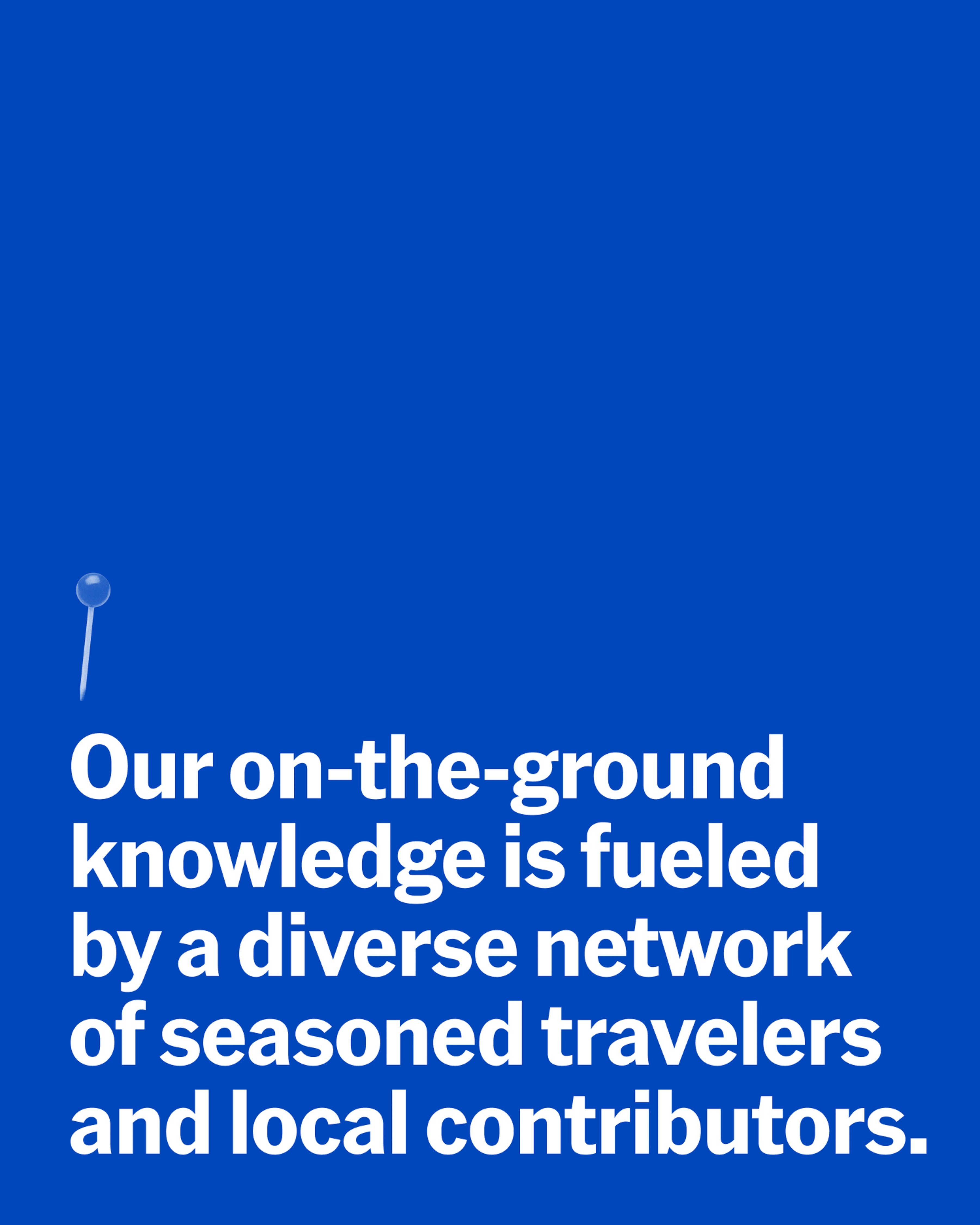
Using on-the-ground knowledge from a suite of local contributors, Lonely Planet's guidance is curated, responsible, and insightful, from well-trodden global cities to out-of-the-ordinary destinations.
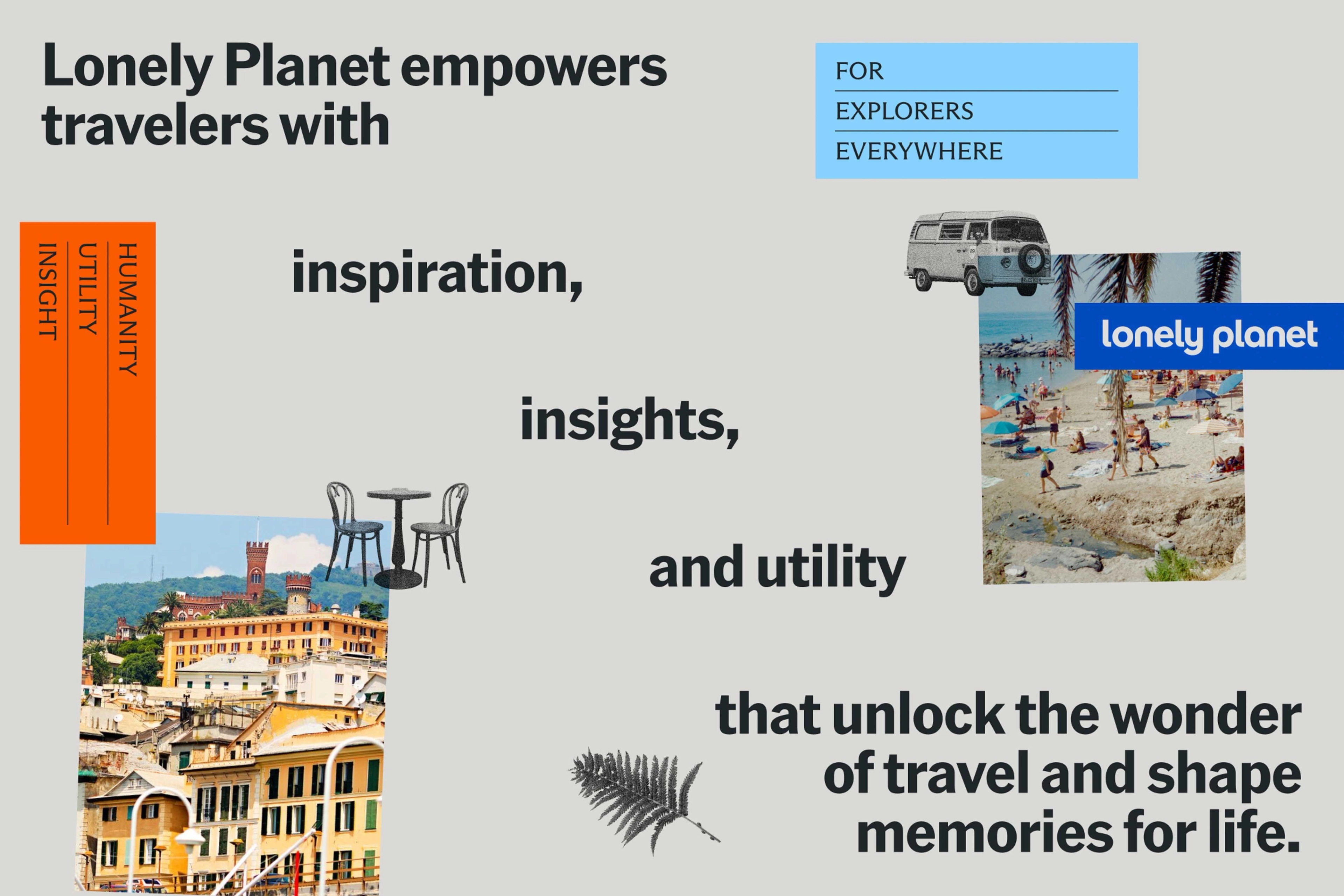
Anywhere you want to go, Lonely Planet’s been there—
and they’ll tell you everything they know.

System Elements
To pay homage to Lonely Planet’s roots in print, GrandArmy created a brand system that feels handmade, maintaining the element of human connection. Using cutouts, layering, and stamping, the new identity digitizes analog techniques to marry the worlds of print and digital into something that feels uniquely Lonely Planet.
Lonely Planet stamps are a nostalgic, “xeroxed” representation of our travels; they are core to the brand identity. This graphic system allows us to visually represent destinations, travel experiences, and top recommendations in a way that feels both on-brand and hyper-local.

Stamp icons can be used in a variety of ways: to communicate Lonely Planet’s recommendations, to establish consistent imagery for regular content, to evoke an experience, or add context to a destination. Blending modes and tonal treatments allow them to easily integrate with underlying color and photography.
Publishing
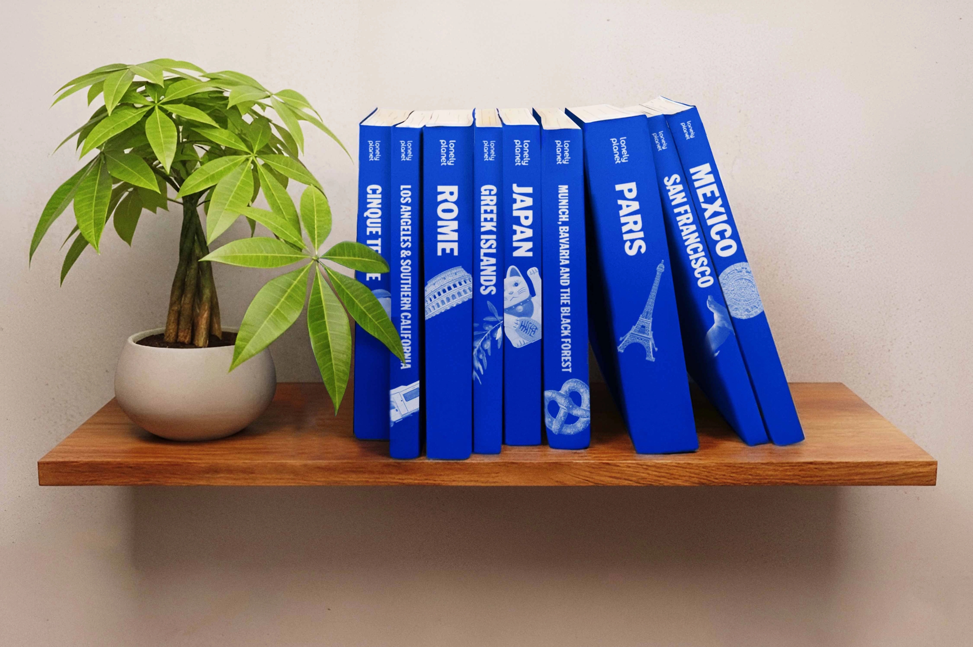
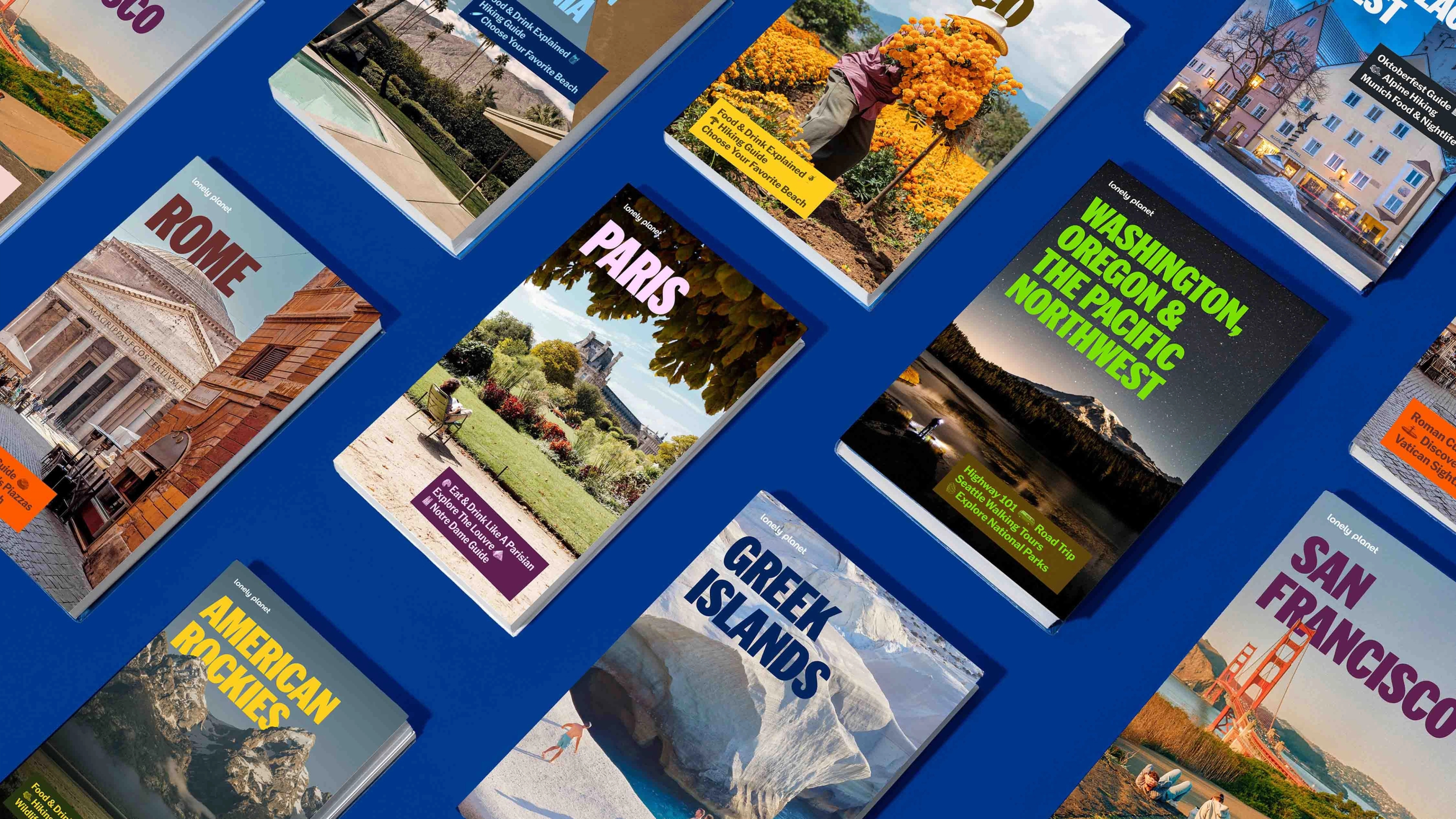
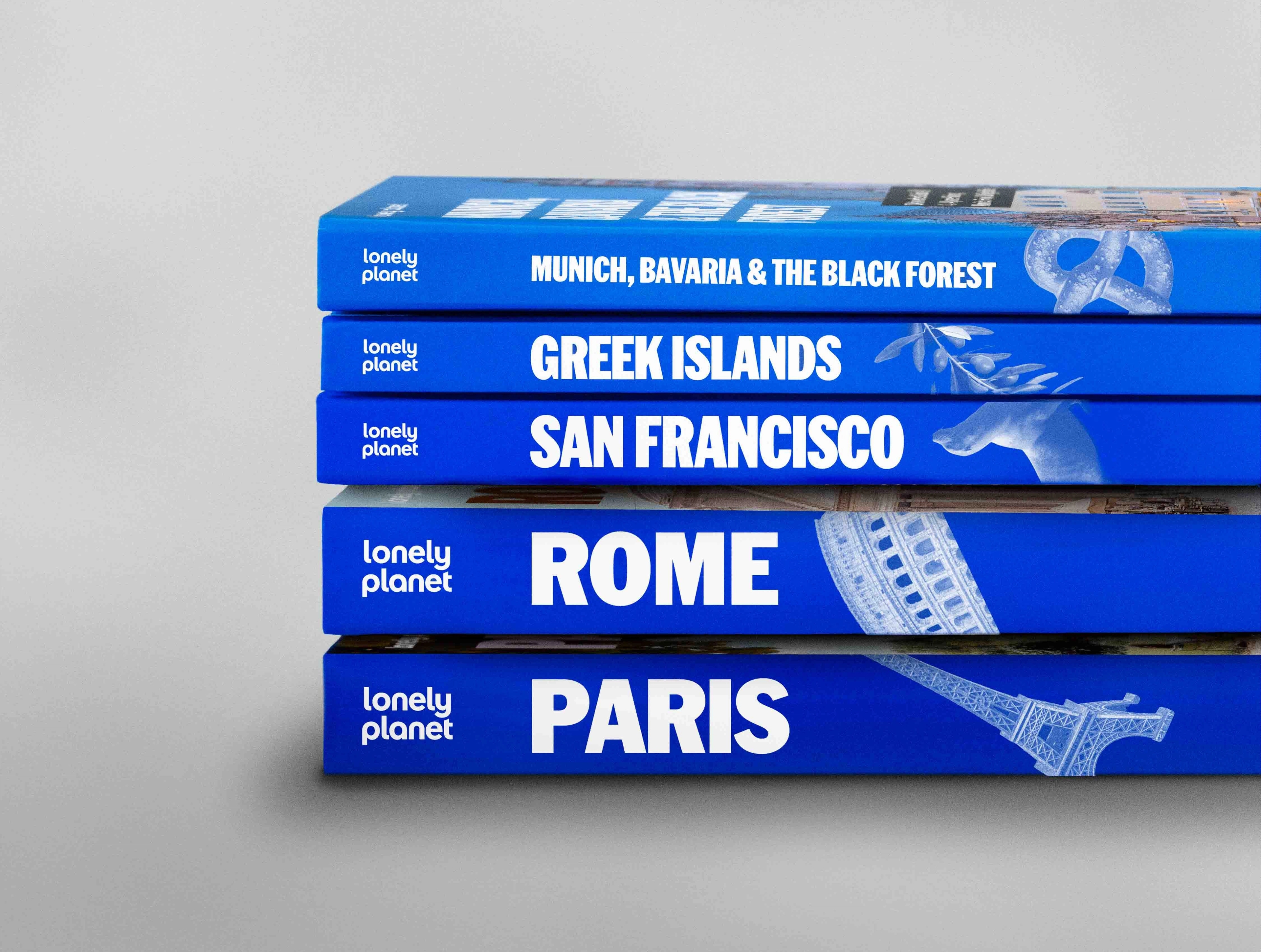
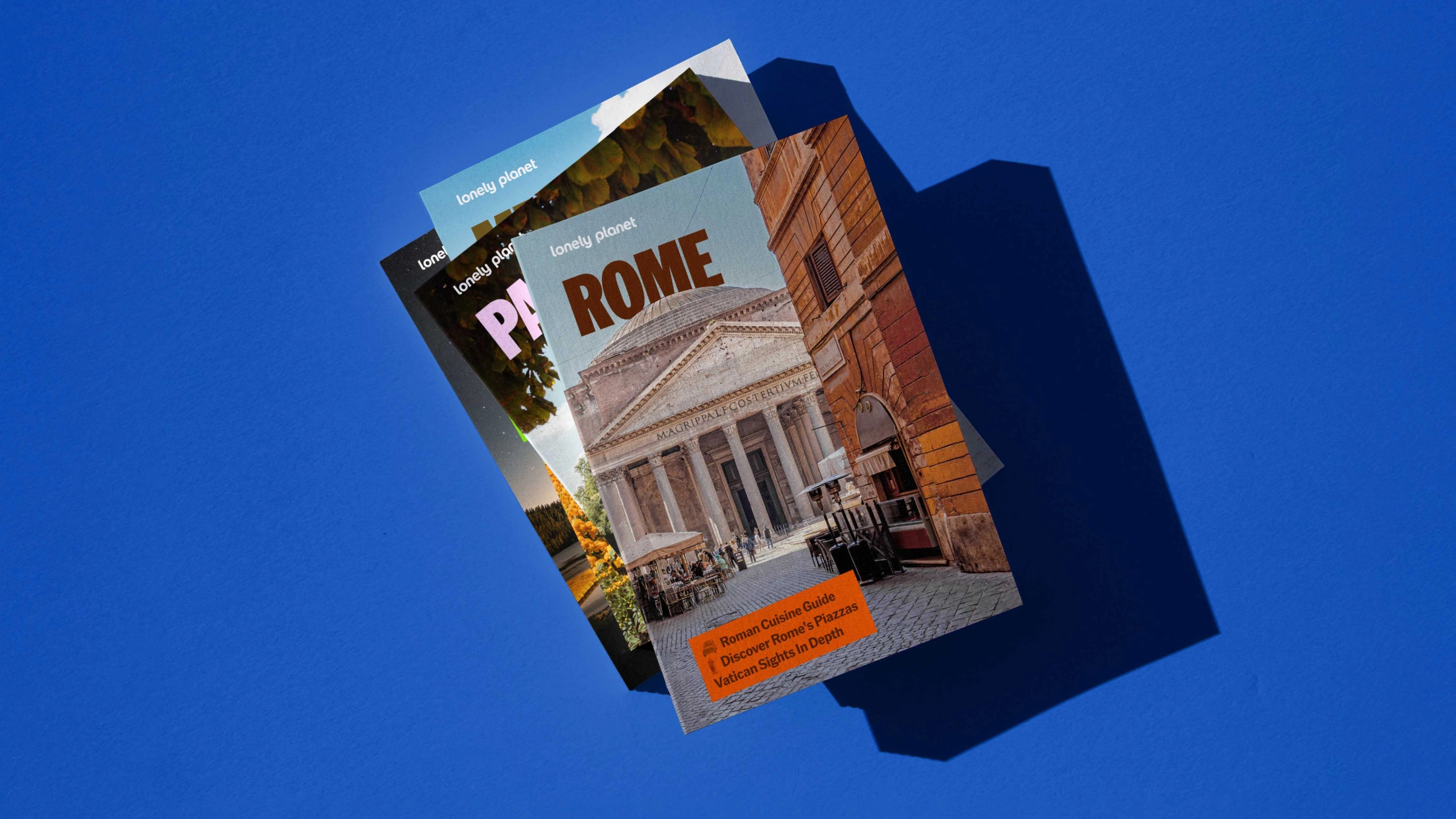
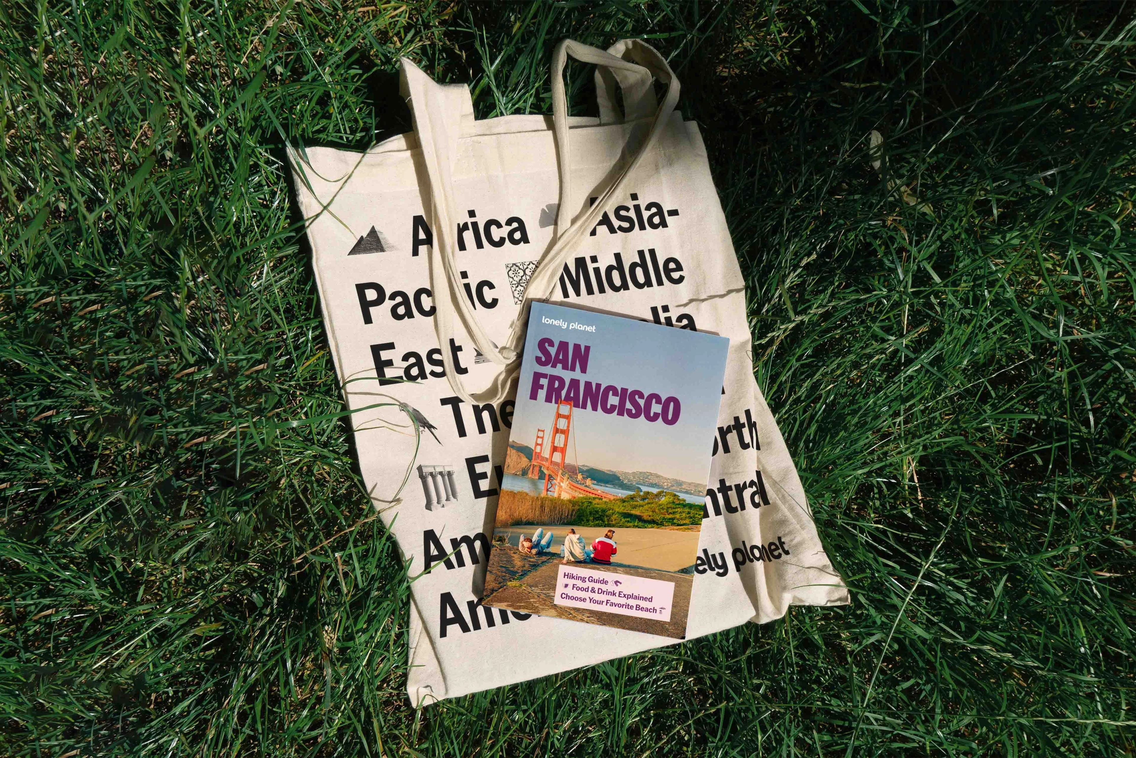
Lonely Planet’s most known legacy are their extensive suite of collectible guidebooks, also referred to as “blue spines”, that fans keep as totems to trips taken. GrandArmy built out a system for these guidebooks to help them feel both cohesive and expansive.
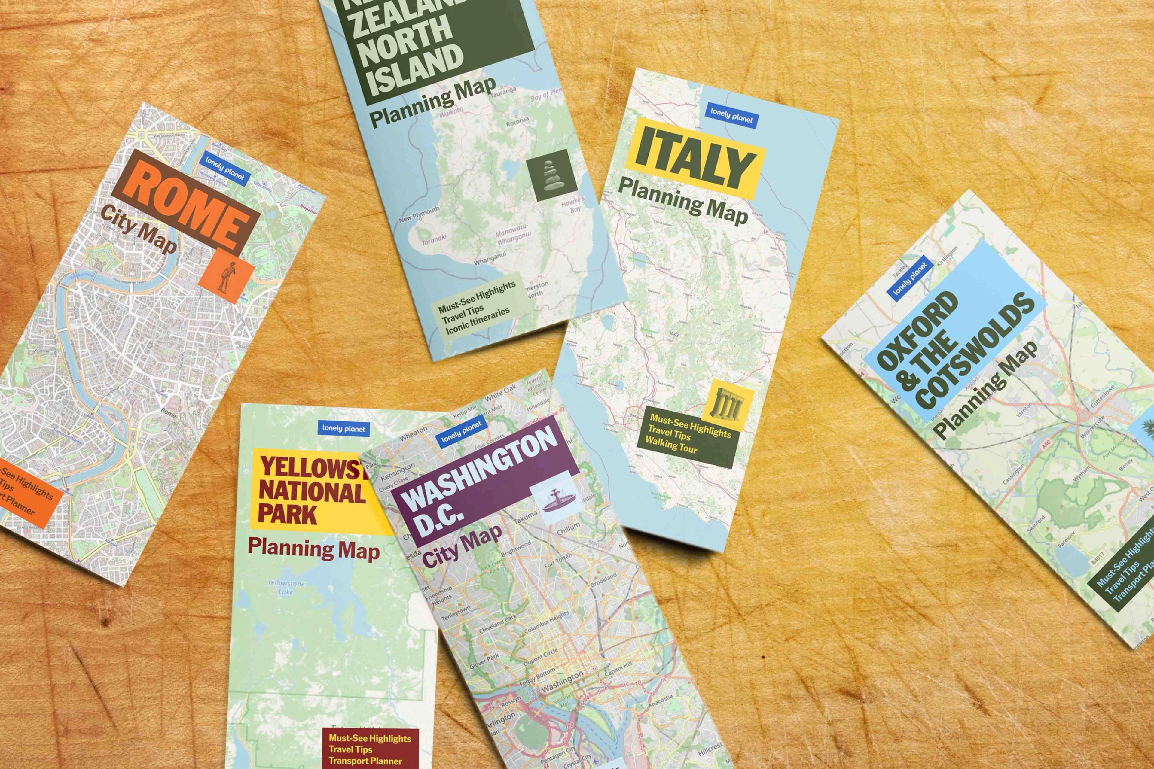
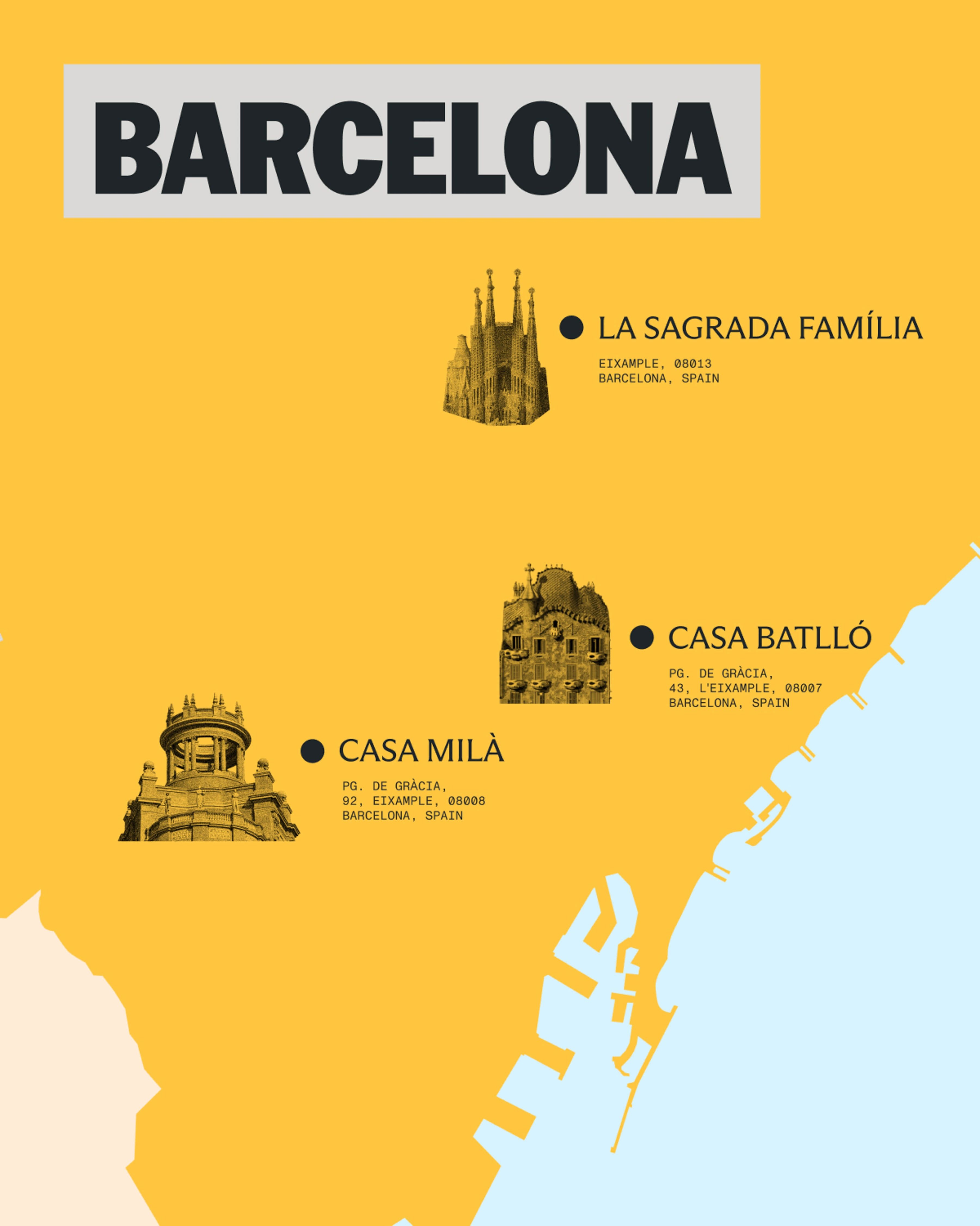
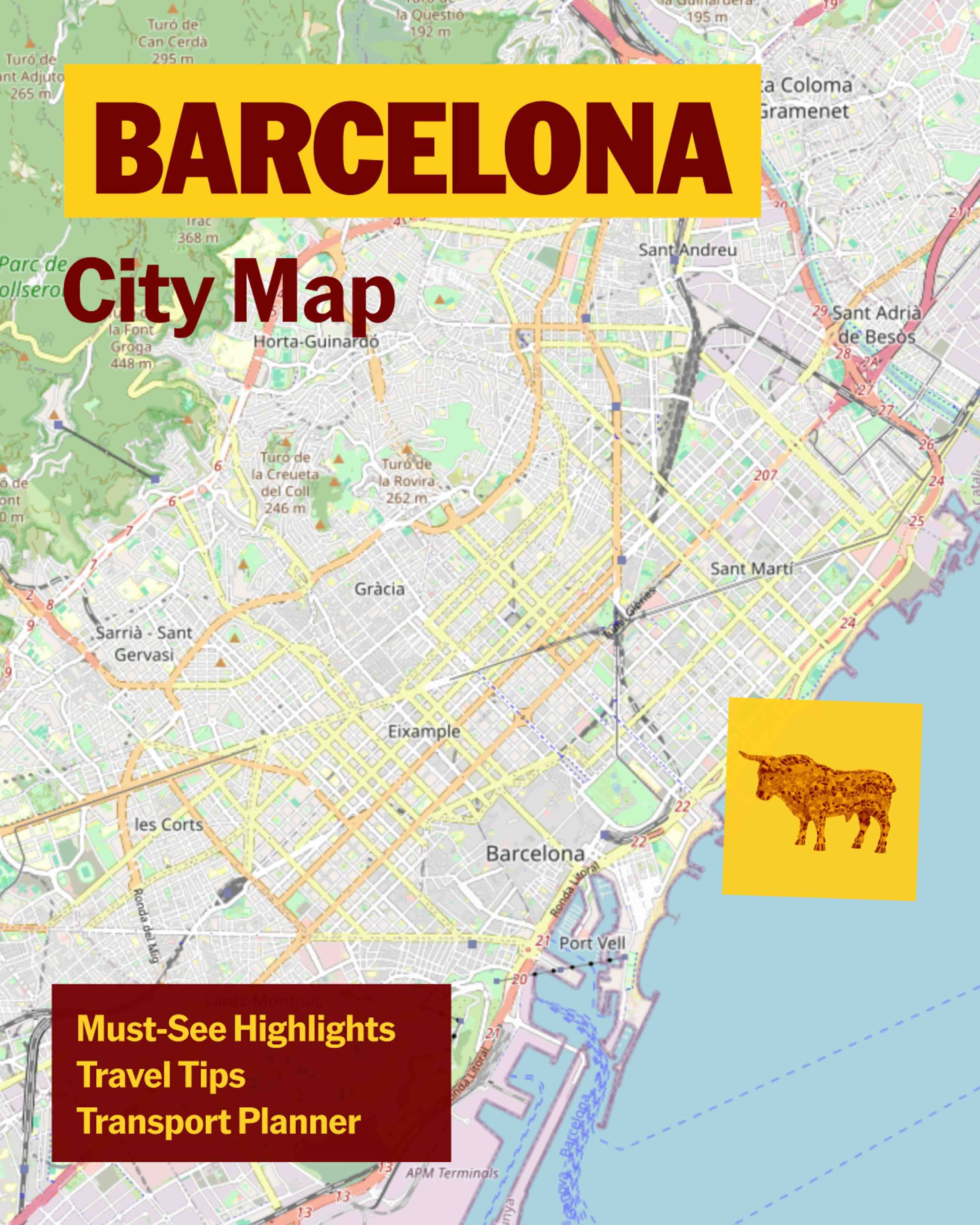
We created two distinct map styles: a stylized map style in the brand language to highlight points of interest, and a more traditional street map for function.
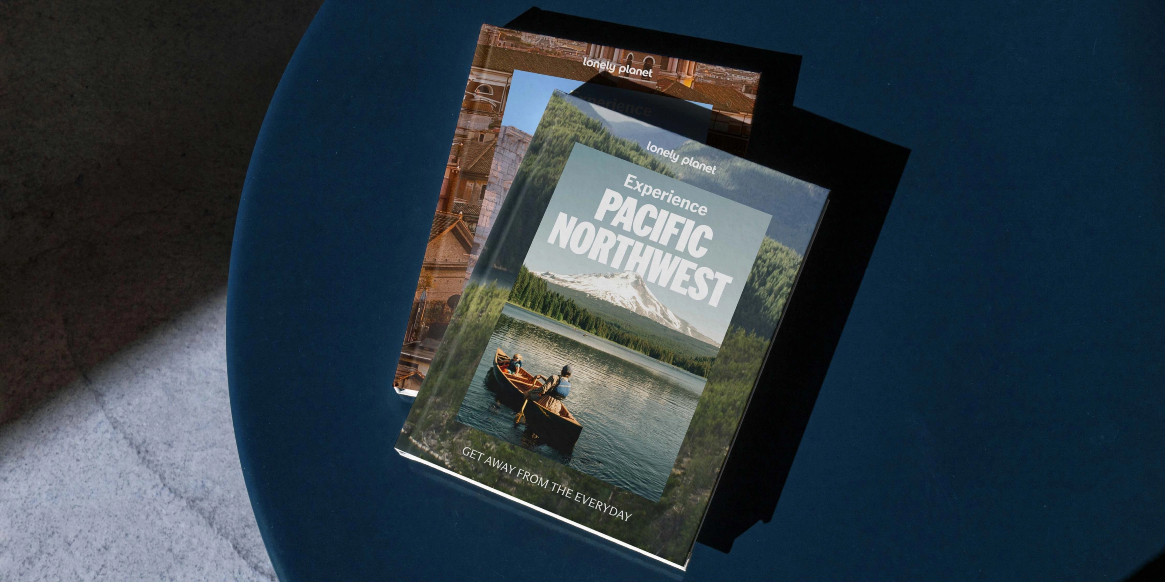


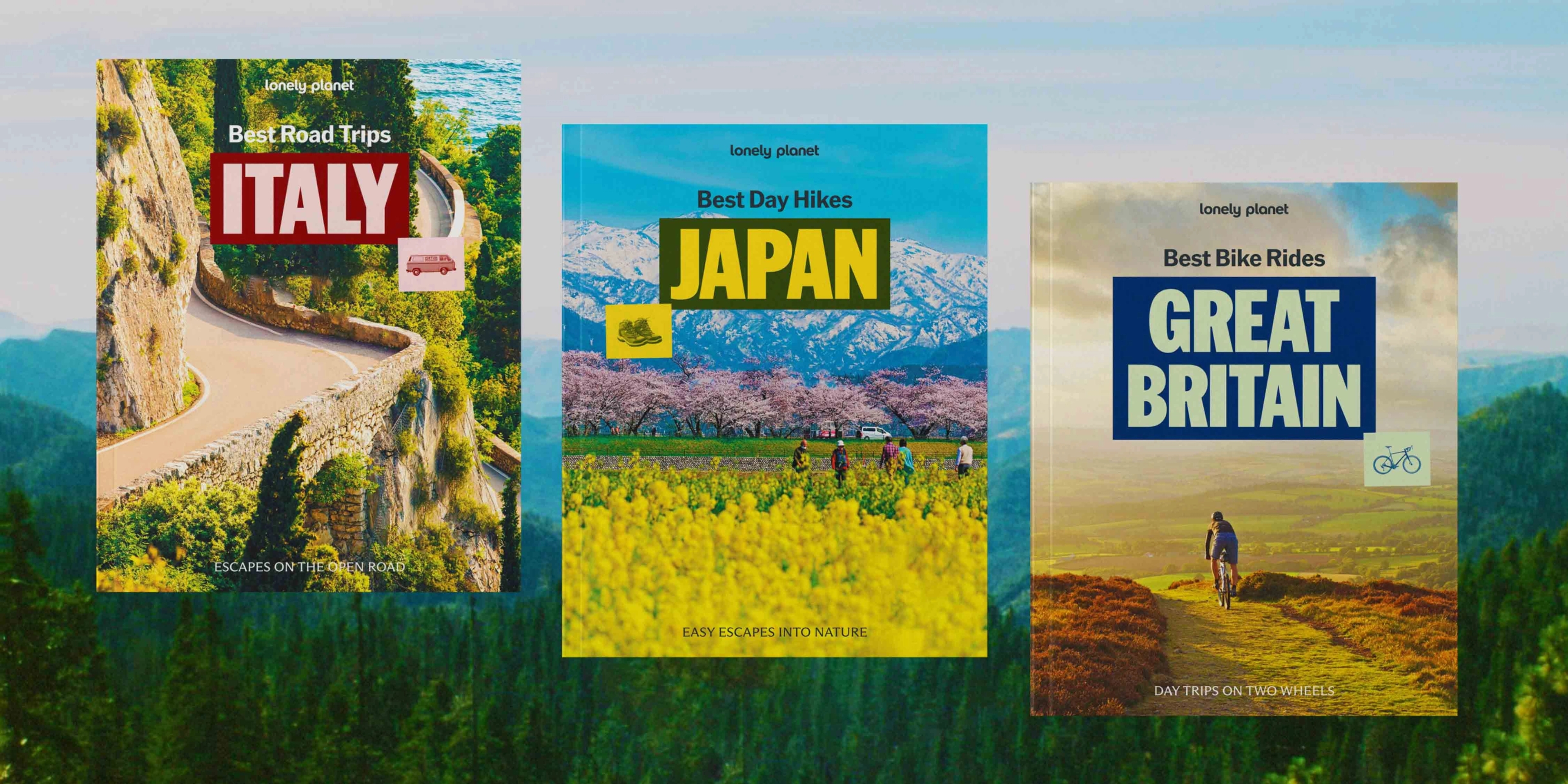
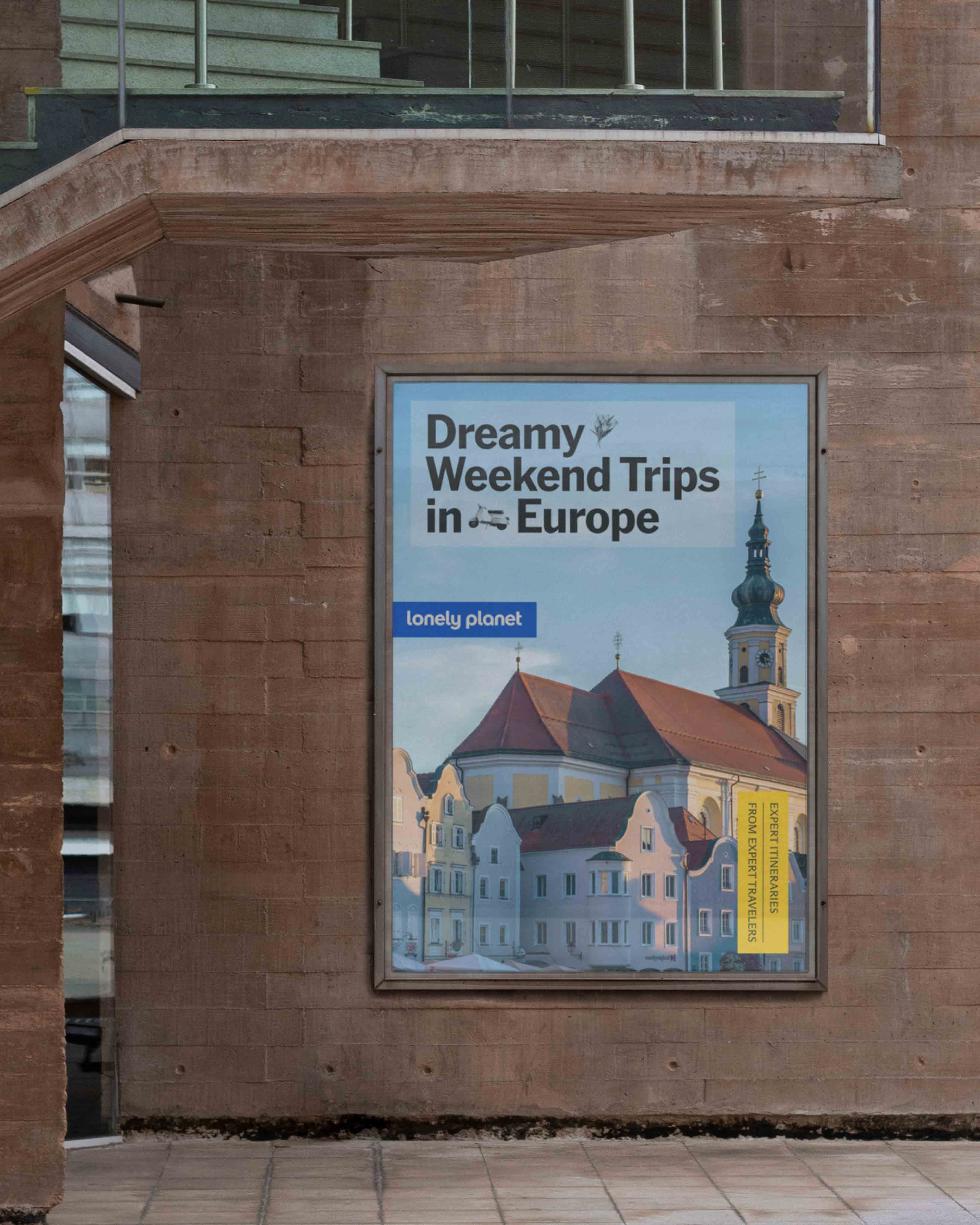
Beyond Guides, Lonely Planet’s publishing offerings exist to inspire and transport travelers around the world. Each title is bespoke and gift-able, for a unique audience and retail environment.
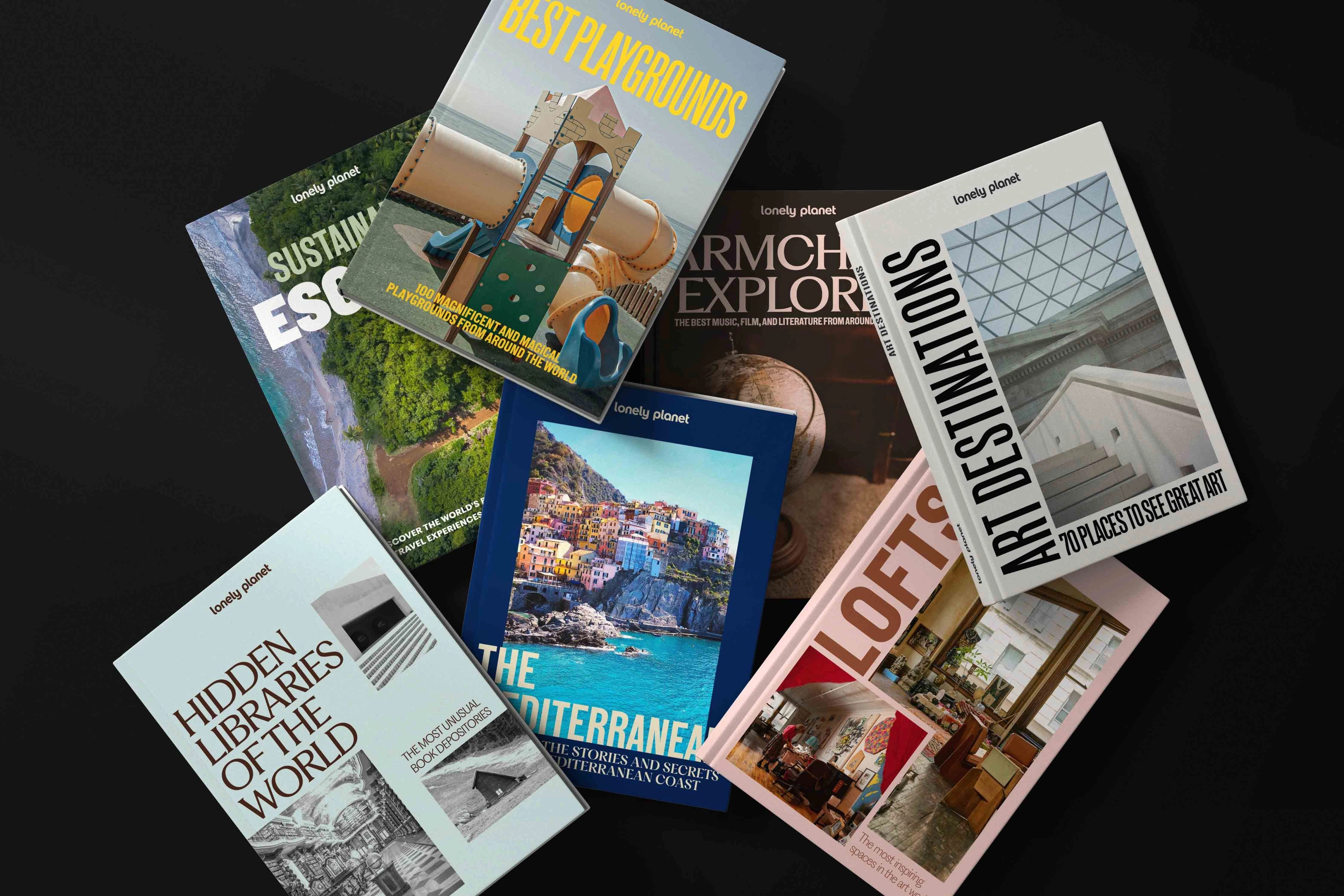

While some key principles are retained across the entire Lonely Planet brand, the Inspiration & Gift category introduces a new flexible grid system designed with versatility in mind, accommodating the many cover layouts and book sizes across the Inspiration & Gift category, while maintaining overall consistency.
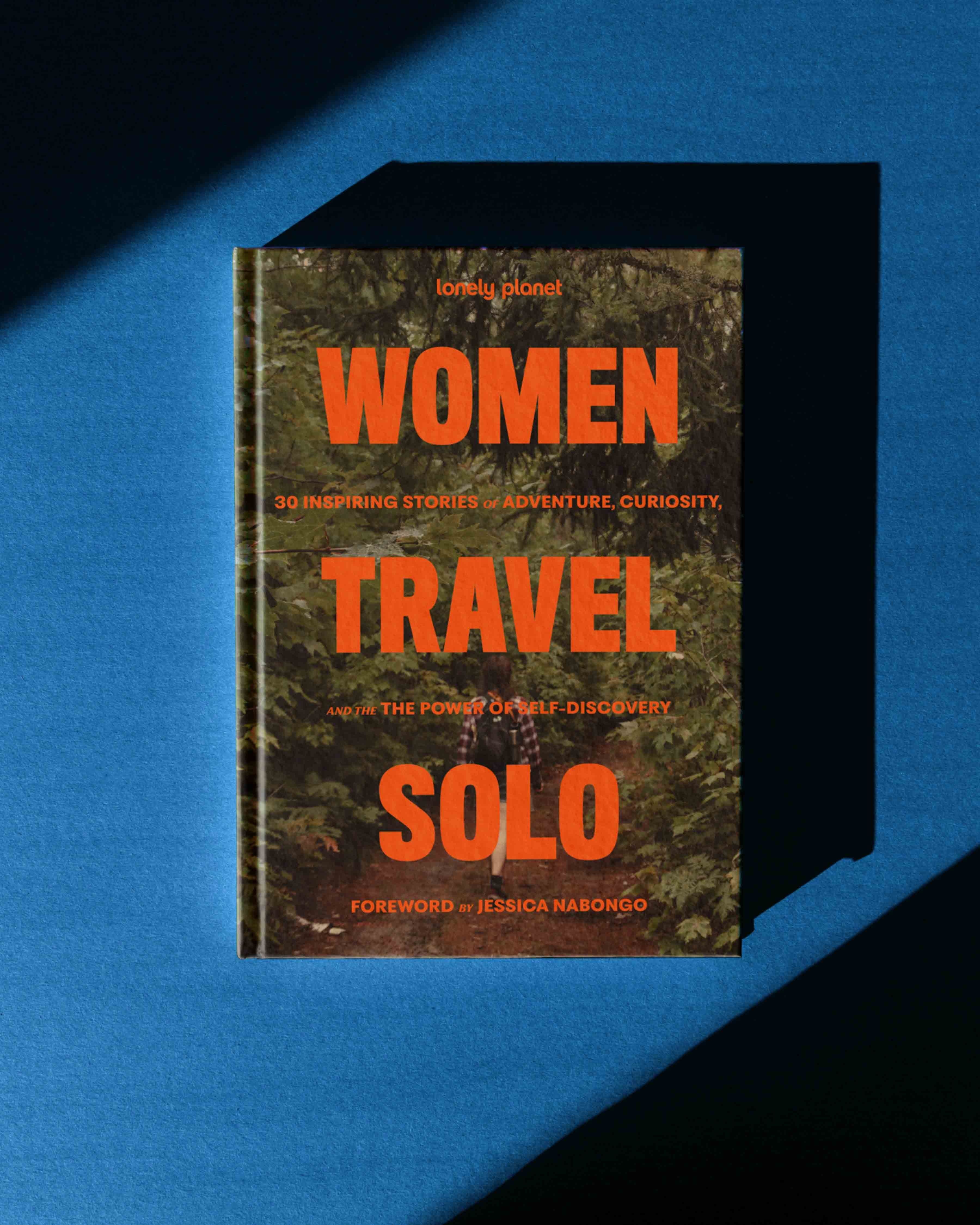
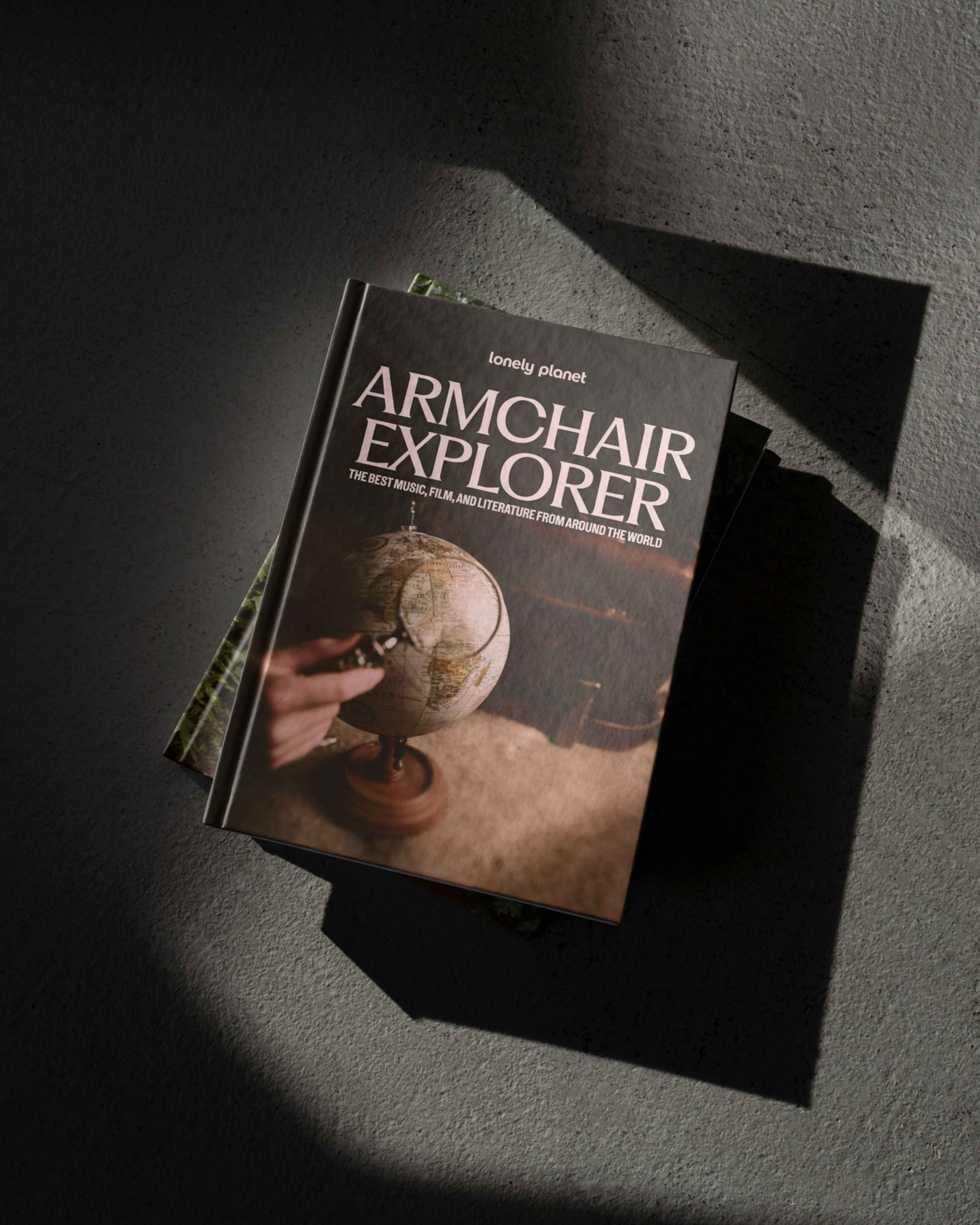
The premium gifting category is also Lonely Planet’s opportunity to be more expressive with production finishes such as printing treatments, textured paper stocks, and illustrative cover artworks.
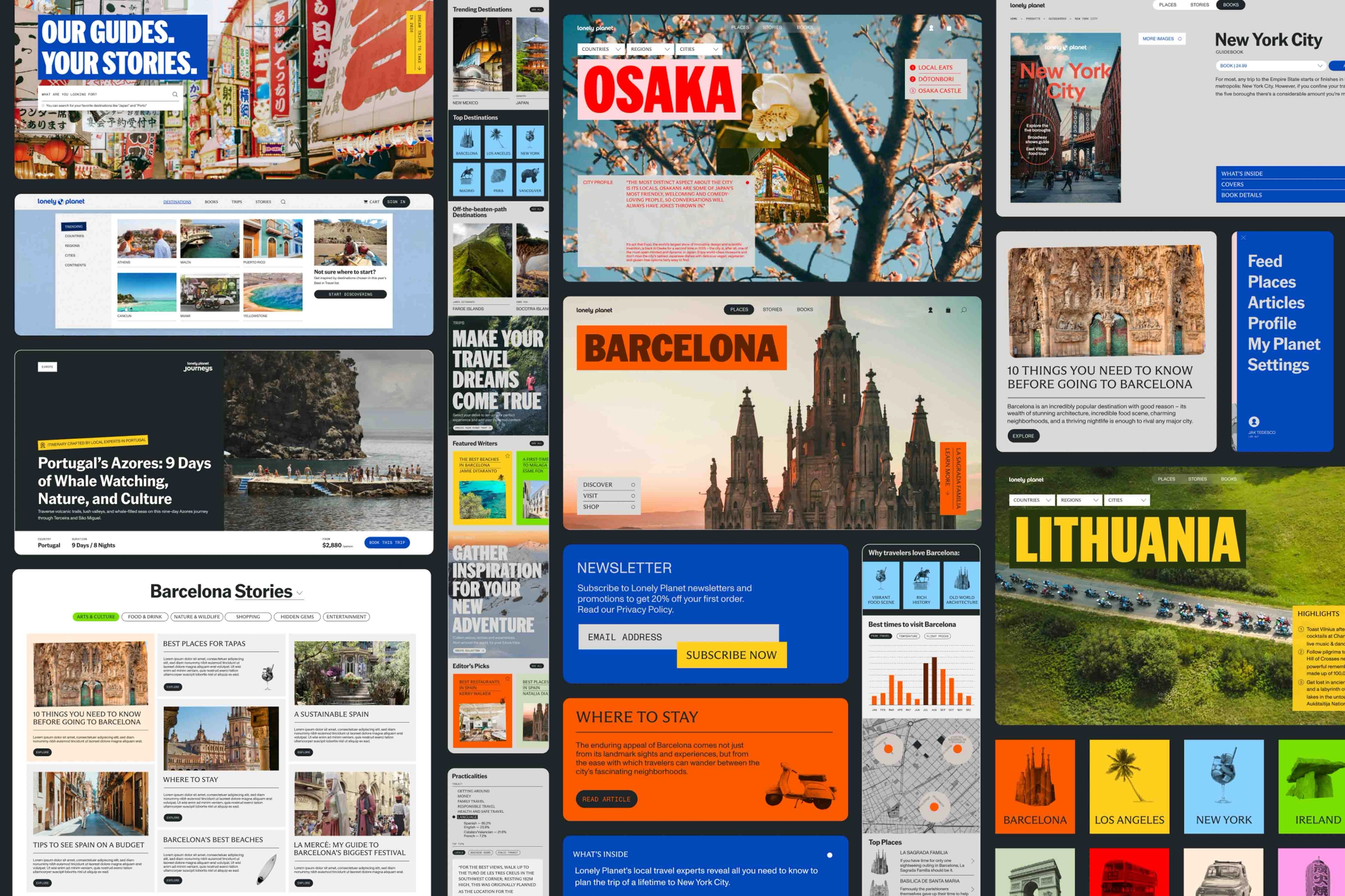
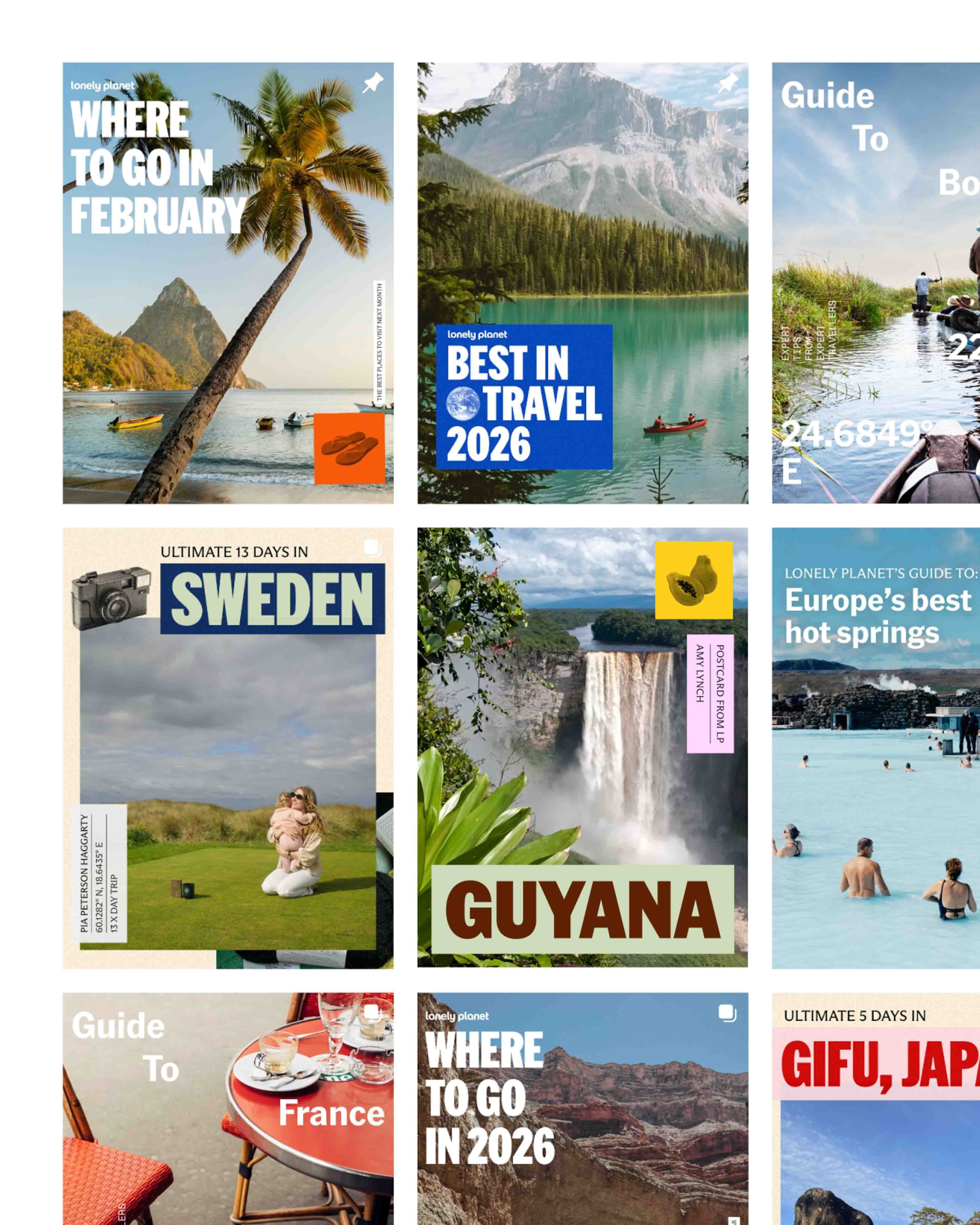
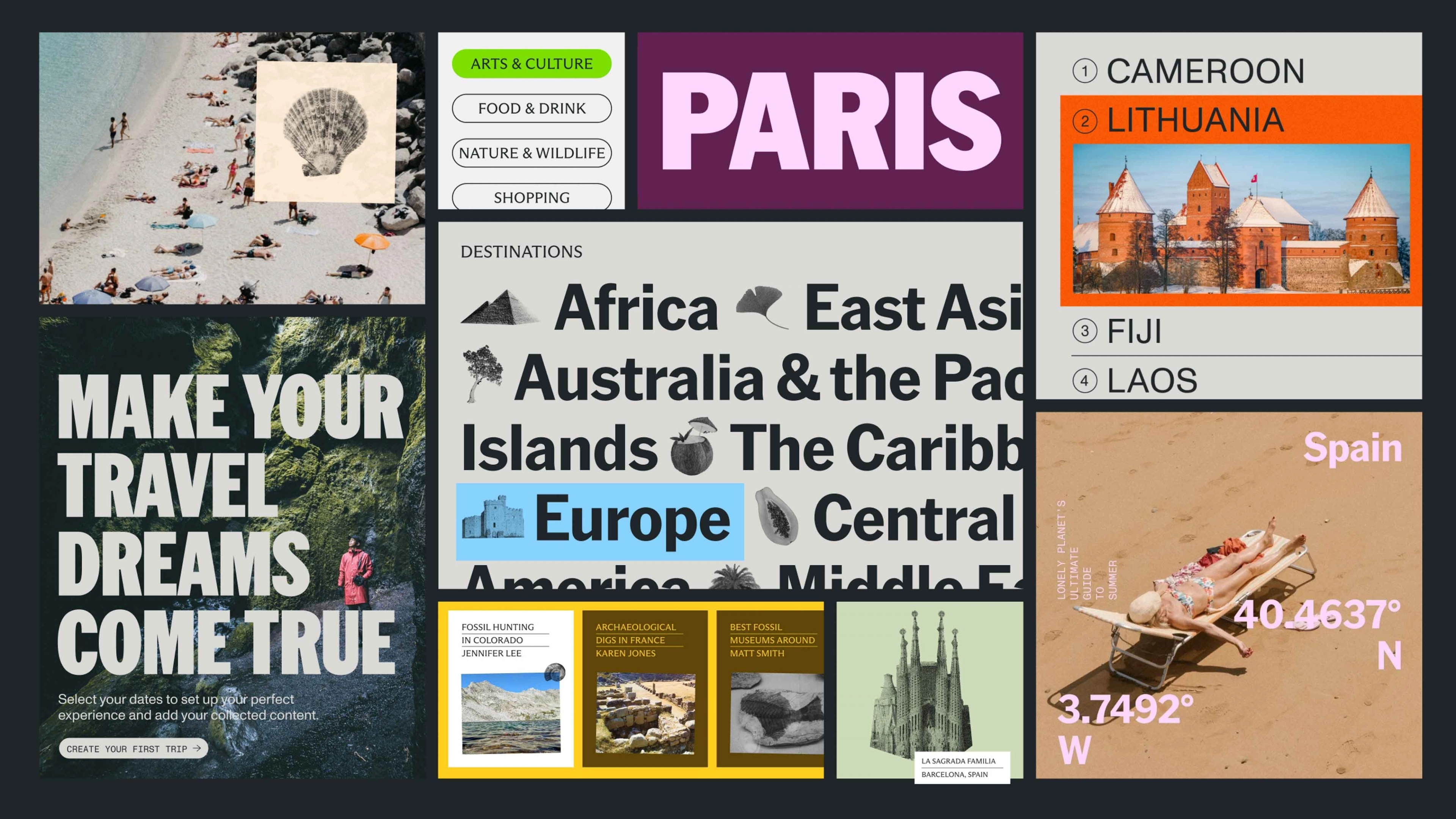
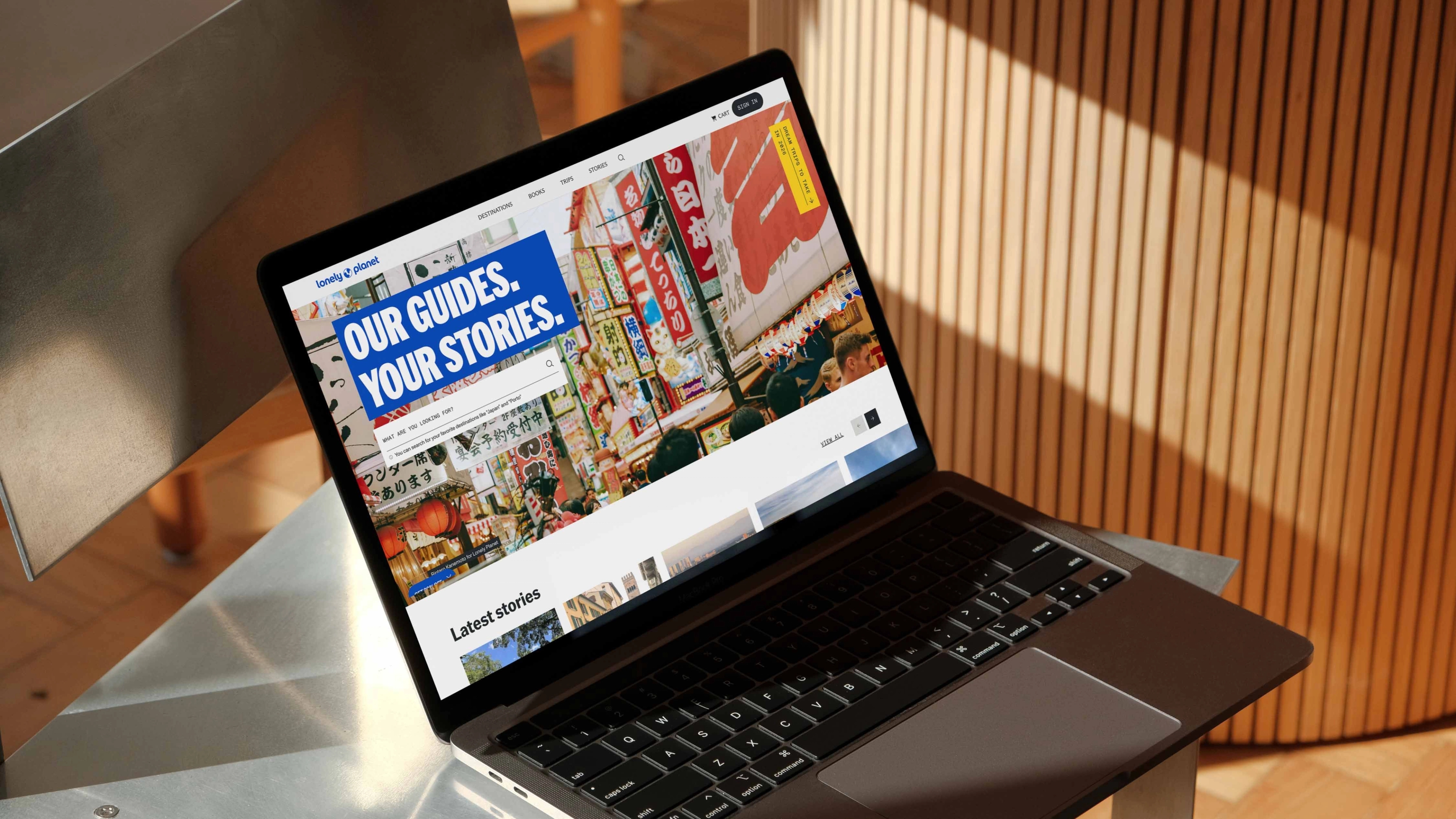
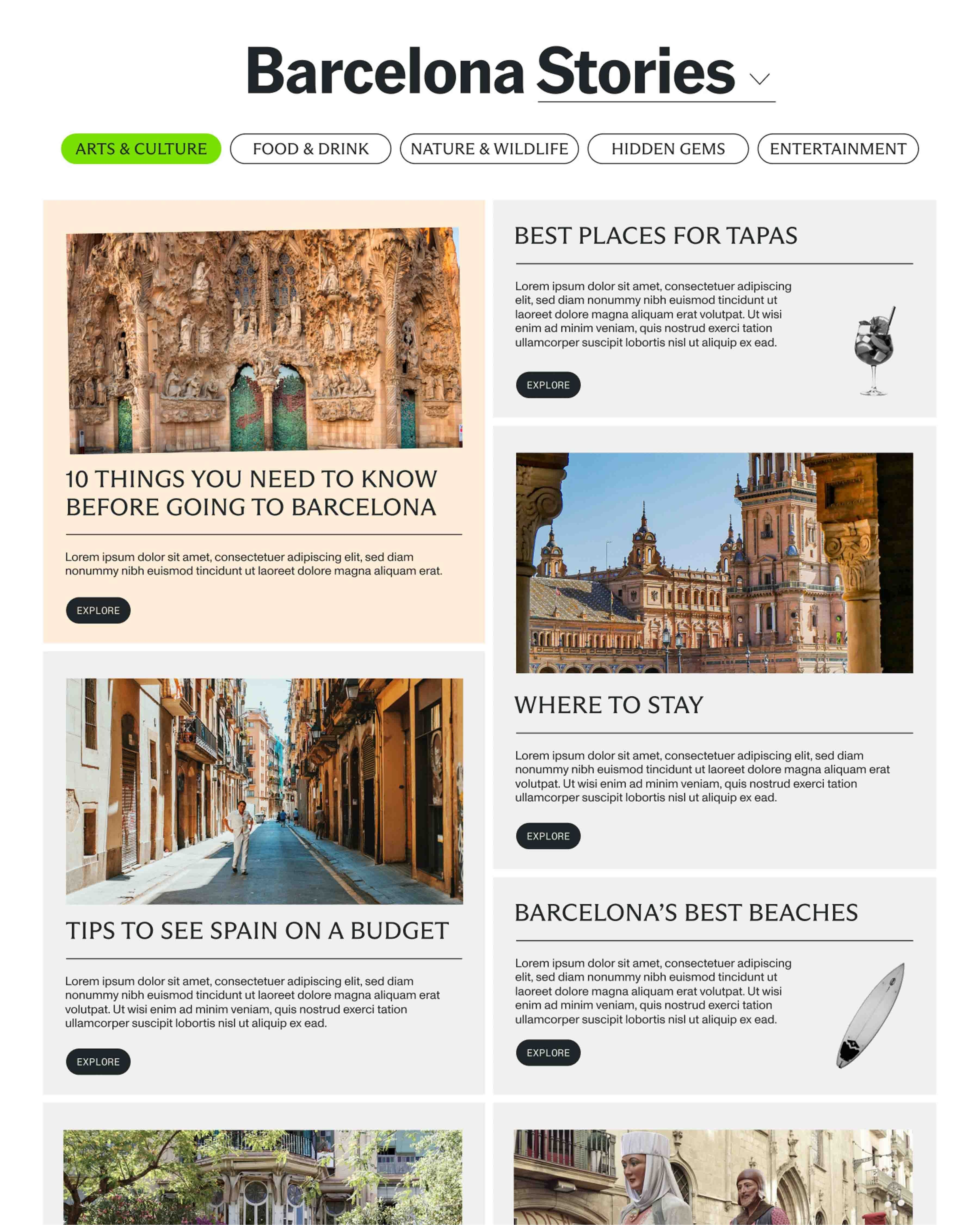
Web Design
Continuing the visual thread from print to digital, we created a dynamic website that uses layered panels to create a sense of interaction and discovery. The Lonely Planet site flexes between maximal brand expression and a more toned-down, easy to navigate interface when needed.

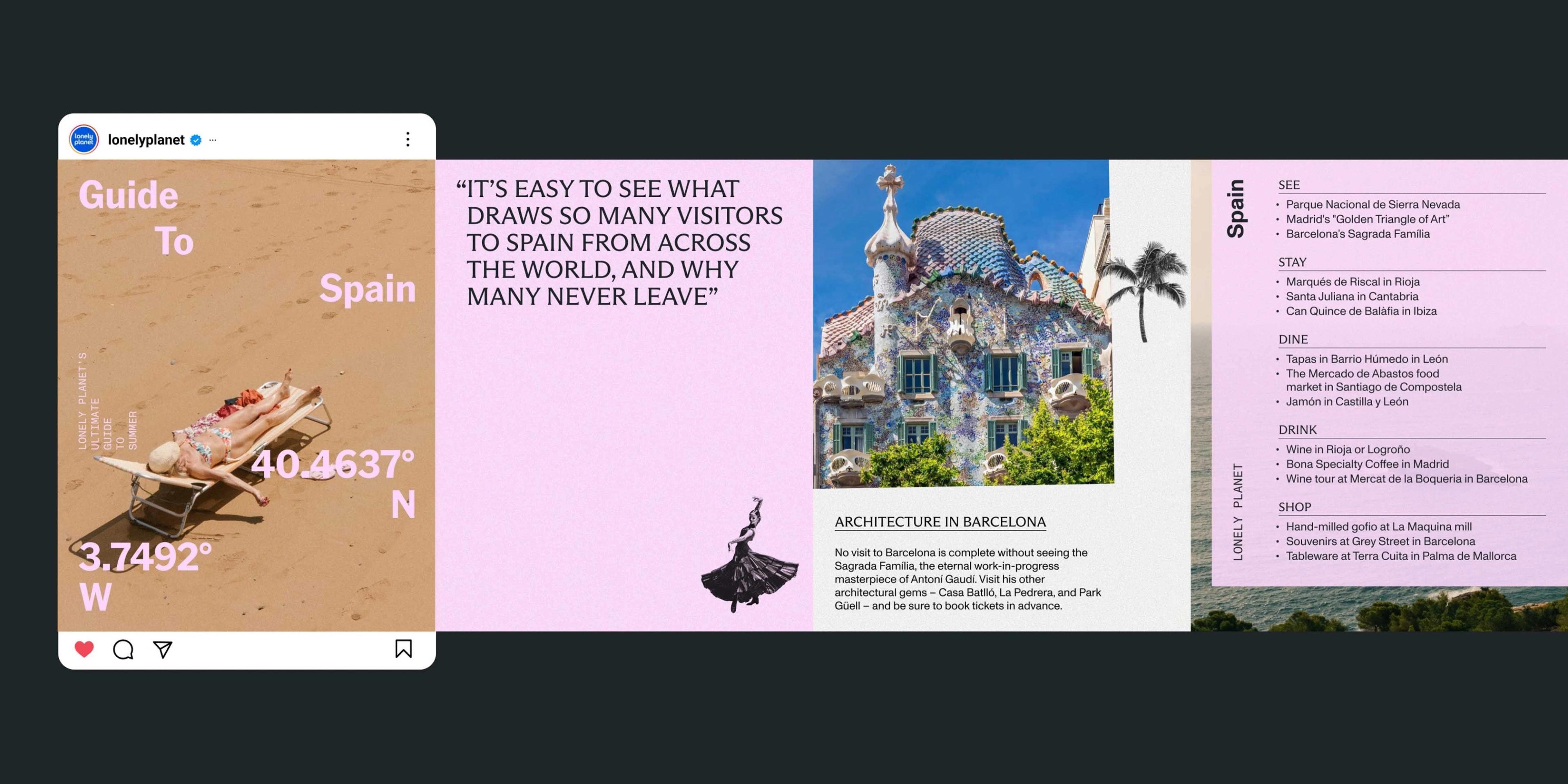
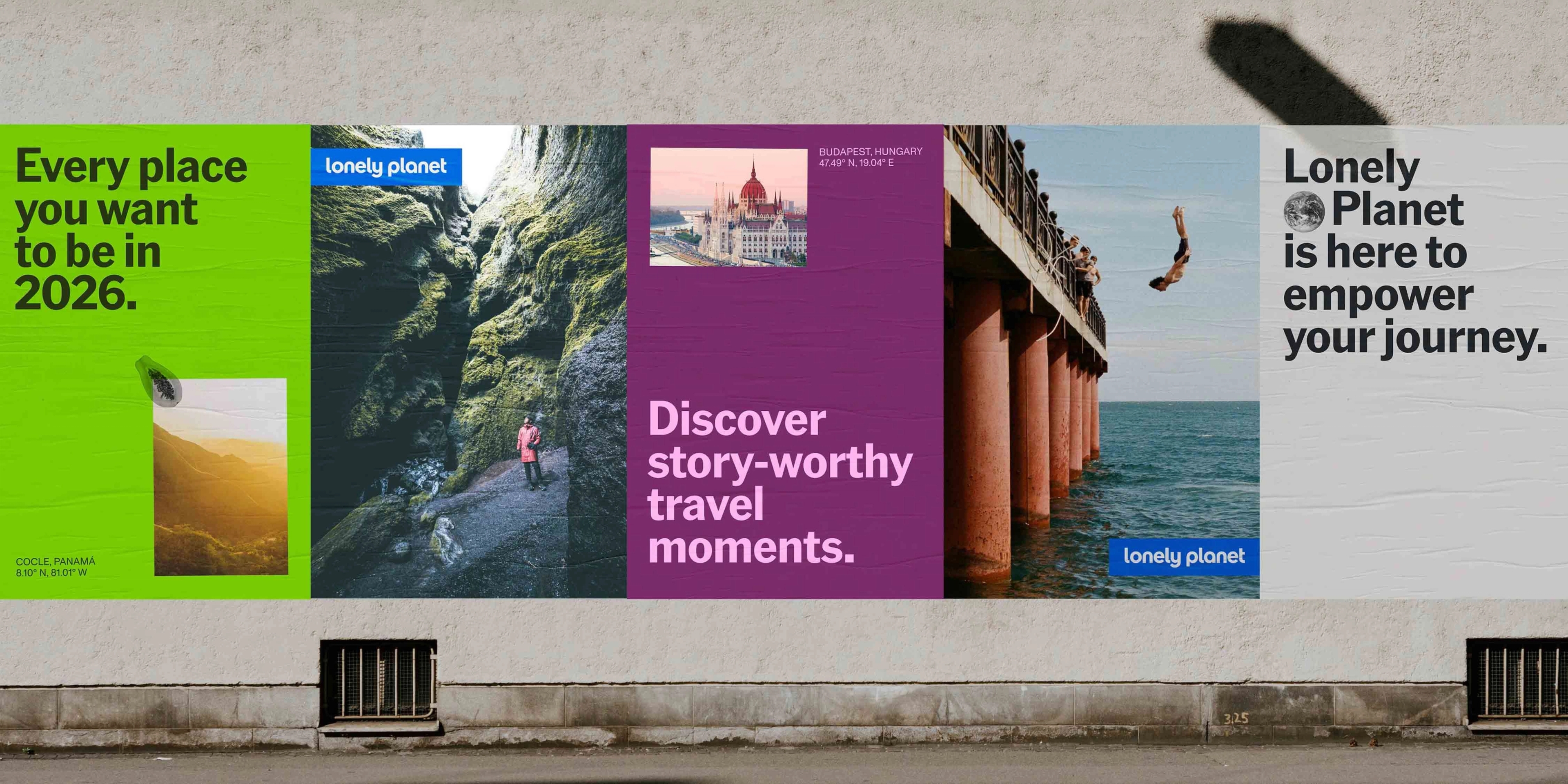
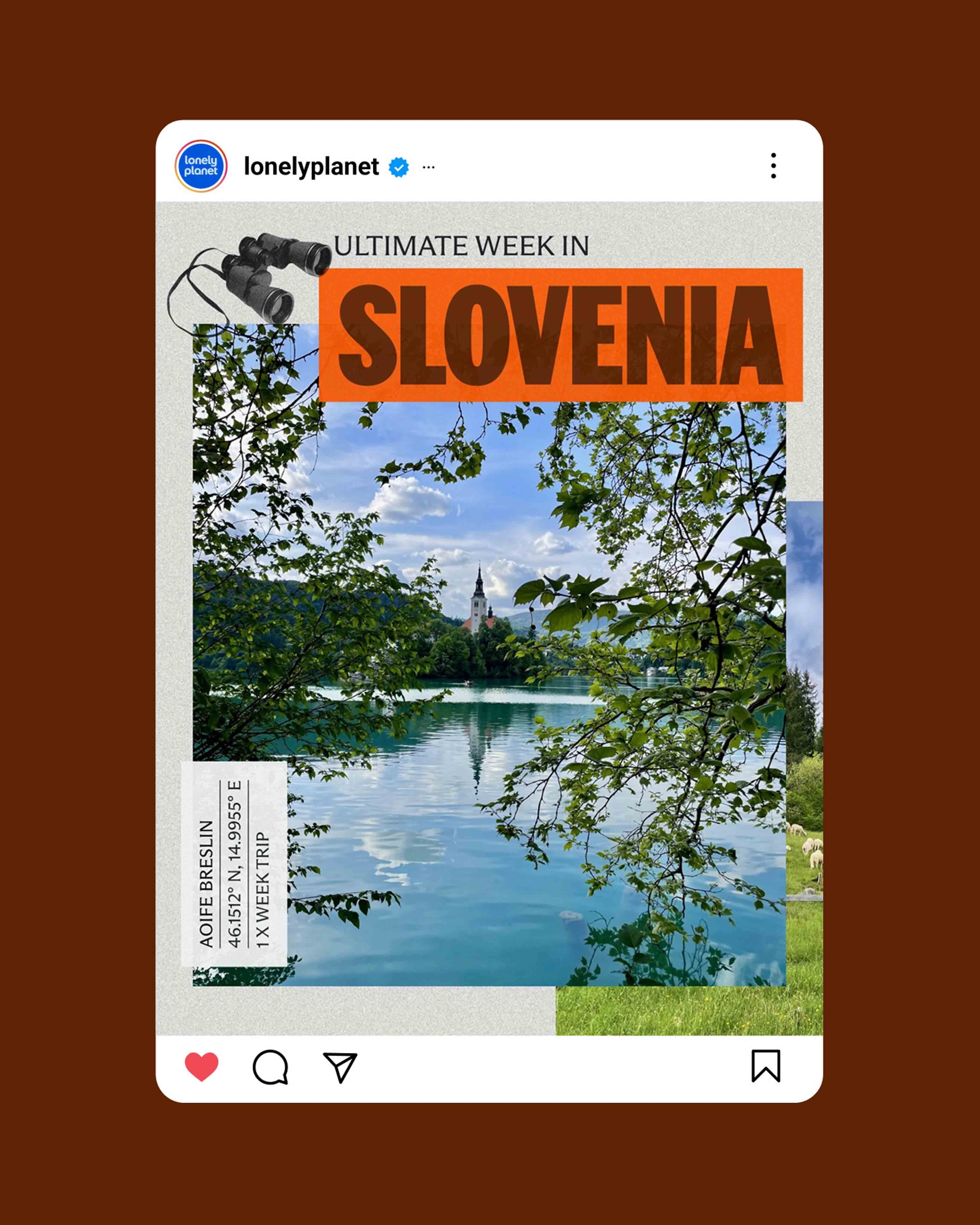
Social
Continuing the expansion from publishing to digital, Lonely Planet sparks wanderlust on social media in an informative, yet personality-packed manner.

Project Type
Brand Identity, Brand Strategy, Campaigns, Web + App Design, Illustration
Credits
Creative Direction: GrandArmy